Tuesday 30 October 2012

Bauhaus/Constructivist Poster

With this poster, I am projecting the message that the student’s fight against the increase of tuition fees in Quebec have come to a positive ending. The text at the top of the poster says: “Ensemble, nous avons bloqué la hausse”, literally meaning “Together, we have blocked the increase” showing that as students, they reached their goal and maintained the initial cost for education. Because it is a poster made in the context of education, it mainly targets students and therefore generally a younger audience that took part in the protests and overall movement. In regards to where it could be seen, as the previous and actual posters regarding this theme, they would be placed anywhere near schools or government buildings.


To create this poster, I have used two of my personal photographs. As a base, I took the one of the flower, rotated it, and turned into black and white to reflect on the photos used in Constructivist posters. Afterwards, using my inspiration of Lyonel Feininger, I took a fragment from the portrait photo (the smile) and applied it to the first. The application refers to Gustav Klutsis’s photomontage idea, as I pasted the smile into the flower’s contour to create somewhat of a collage. 


Moreover, to incorporate a Bauhaus feel to the poster, I used their common colors of red and grayscale tones as well as one of their basic shapes – the rectangle. These were made with the selection tool in Photoshop. Also touching on the Bauhaus style, the text made in Illustrator has the flipped aspect, to make the text element not obviously legible.

From a symbolic approach, the poster is made to mark the end of the protests. Therefore, the flower is placed there as a sign of peace, whereas the smile is a symbol of happiness due to the fact that students have come to a positive result.   


The inital sketch for the design idea:

Thursday 25 October 2012

Iconography!

For my icon, I decided to do a somewhat nonsensical rendition of an airways company - "Norwegian Nairways"

It is called that way due to the fact that to make the airplane on the icon I used two letter "N"'s.


Wednesday 24 October 2012

Inspirations for Bauhaus/Constructivist Poster

As far as it goes for my Bauhaus/Constructivist poster inspirations, I chose one artist from each style.

From the Bauhaus school of design, the American-German painter, Lyonel Feininger caught my eye. I particularly enjoyed his cubist approach and the fragmented nature to his paintings. The fact that he reflected on the expressionist movement, focusing on the feelings emanating from his works versus realist depictions, also played a role in the creation of my poster.


Furthermore, the constructivist artist, Gustav Klutsis also inspired my poster. Klutsis mainly created work that had a communist agenda and that showcased propaganda or revolutionary imagery. He worked with various experimental media, using sculpture, installations and illustrations. However, he is most known for his photo-montages that portrayed powerful and somewhat eerie images.


What I will take away from Feininger is the fragmentation and sharp lines he applies in his paintings, whereas from Klutsis's work, my influence derive from his political message as well as the technique of photo-montage and use of the color red.

Thursday 18 October 2012

Tuesday 9 October 2012

Joseph Cornell's Boxes


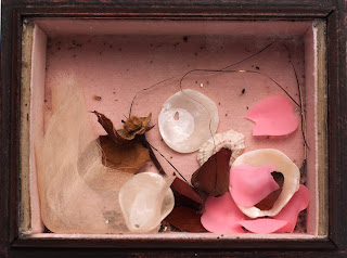
I particularly enjoyed Joseph Cornell’s artwork, mainly because it was a very unique type of collage, one I have never come across before. When I think of what a collage is, the image of many assembled photos or newspaper clippings come to mind. In any case, the collage would be flat. What surprised me in Cornell’s art was that, him being an artist and sculptor, he created three dimensional collages. Also, the fact that his collages were simple and all the while surreal (much like the artistic movement that inspired him) intrigued me. The use of objects collected by Cornell or things that at first sight seem mundane to us, are arranged in a manner that they suddenly look somewhat ethereal. 


Taken from Joseph Cornell’s personal website:

“Cornell created visual poems in which surface, form, texture, and light play together. Using things we can see, Cornell made boxes about things we cannot see: ideas, memories, fantasies, and dreams.”

Taking a closer look at his work, I realize little by little that this concept is quite applicable to his work. When observing his boxes, one does feel somewhat nostalgic, touched and is left wondering. 


Thursday 4 October 2012

CD Cover

For my CD cover, I chose to create my interpretation of the 2006 album "Magic Potion" from The Black Keys. The idea behind the cover was to make a "cartoon-ish" representation of a "magic potion", in relation to the album title. The colors and the shapes of the design reflect on what comes out of a black cauldron (the background) - the fumes and bubbles of a brewing magic potion.

Initially, I started with a design I drew myself. It was meant to be an abstract drawing, simply done with a sharpie. I then scanned onto the computer and with the use of levels (in Photoshop) I erased any textural background and made the drawing completely black so that it would be easy to work with the contours.

After placing the drawing on a new layer and shaping it in the way I wanted it to look on the cover, I found harmonious color combinations and filled the shapes within my drawing. Furthermore, I used the "stained glass" filter to incorporate the drawing with my chosen dark background. I selected different parts of the design and applied the filter in varied sizes for an even more abstract and composed look.

Finally, I downloaded a cartoon inspired font to complement my design and used the colors from the cover design on the back cover for a sense of continuity. Selected parts of the frontal design was also used for the same reason.


In the end, I think my concept translated well visually and the additional inspiration of Victor Moscoso's balance of colors is also apparent in the final product.
Humanist Type! Although they all have a classic, simplistic look to them, I chose "Lynton" because     it aesthetically appealed to me.